Why Animate a Logo

Animating a logo can enhance the logo and its impact.

Because our eyes are naturally drawn to moving things, animating a logo, even in a very simple way, can make it more attention grabbing. A custom logo animation can make the brand stand out even more and become more memorable.

If the goal of a logo is to communicate a brand’s essence, animating it should assist in that goal and even convey additional info about the brand.

The way that the logo is animated should give insight about the brand.

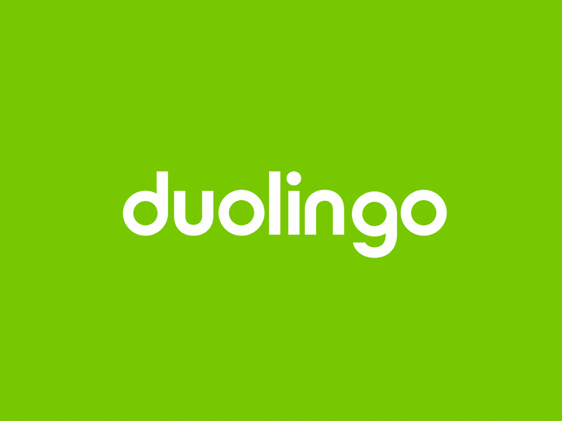
This Duolingo logo is bouncy and playful which aligns with how Duolingo gamifies learning a language with their fun animated characters.

This Uber logo animation, on the other hand, has a much more serious feel. It’s simple, yet effective and the parallel lines that look like lines on a road hint at what Uber does.

When planning your logo animation consider how it will be used. For example, the Uber logo animation also works as a launch animation for the Uber app.

A logo animation can help explain what a brand does and could even tell a mini story about the brand.

In the example below, it starts with seemingly abstract circles but then they form the shape of grapes and then swirl into a liquid, all of which is hinting at what the vineyard does.

The Vineyard - James Martin

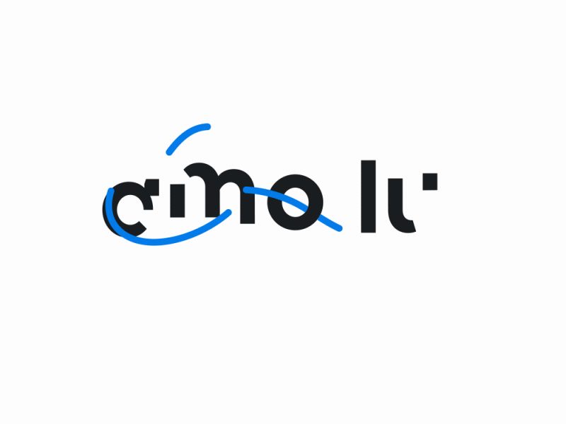
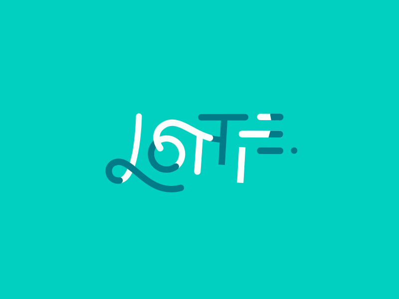
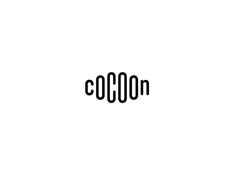
In this logo, when this line twirls around it suggests the shape of a cocoon:

This Google logo animation was designed to transition between different core brands within Google. It’s a unique use case, but maybe it can provide inspiration for your logo animation.


Principles of Animation

Disney’s 12 Principles of Animation were coined by Ollie Johnston and Frank Thomas in their 1981 book, The Illusion of Life. As the title of the book suggests, the goal of the principles of animation is to make moving illustrations believable; to give them the illusion of life.

Even though technology has changed since the book came out, and the principles were originally based on cartoon style animation, most of these principles are still very much relevant to modern motion design. But with that in mind, we’ll be working off a modified list of principles.

Principles of Animation

As you work on your logo animation, keep in mind that not all the principles of animation will be fitting for every logo. For any type of animation, it’s important to use the principles of animation intentionally.

1. Slow In & Out

  • Motion of an object starts out slow, speeds up, then slows down before stopping
  • Also called "Easing"
  • Can make animations more pleasing to the eye (things in real life rarely start moving at their top speed immediately)

Here are the value and speed graphs for Easy Ease. You can adjust these graphs to change the temporal interpolation between keyframes using the graph editor.

Easing on a keyframe level

When you’re animating a logo, you’ll want to adjust the easing of the different elements of the logo.

In this example, I haven’t used any of the principles of animation and all the keyframes are linear.

Now compare that to this version where I’ve added easy ease to all the keyframes, but I haven’t used any of the other principles of animation. The second version already looks a lot better; it’s less mechanical and more smooth.

Now look at the difference when I customize the easing of each element. It’s a lot more interesting because I’ve exaggerated–another principle of animation–the slow and fast motions to make it more dramatic and feel more lively.

This is the final version, that incorporates other principles of animation too.

Logo Examples

Easing applied to an entire animation

Another thing to think about when animating logos, is the overall flow of the animation. It’s not enough to just make sure each element’s motion is fine-tuned. You’ll also want to consider the order and speed in which elements appear and the rhythm they create.

In this example, each letter starts and finishes animating at the same time. Even though the animation on each letter starts slow, speeds up, and then slows down as it finishes, all the letters do this at the same time so it’s predictable; not very interesting.

You also wouldn’t want to animate each letter one at a time because that’s also predictable and going to draw out the animation too long.

Instead, it’s best to stagger and overlap when the letters come in. This is better, but the letters are staggered the same amount for each letter, so the overall animation is linear.

To make this even better, now I’ve staggered the letters so the animation as a whole starts off slower with fewer moving pieces, speeds up in the middle with many things animating at once, then slows down with fewer things moving. This has a nice overall flow to it.

Here are a few more examples of easing applied to the flow of an entire animation:

2. Staging

  • Directing the audience’s attention toward the most important element or elements in a scene to effectively communicate a message
  • Similar to composition in artwork
  • Can help make complicated scenes easy to follow

As you think about how you want to animate your logo, try to come up with 2 to 5 phases or scenes.

In this logo, everything animates in at basically the same time. It’s a bit chaotic and doesn’t flow very well.

To make this better, I applied the concept of staging. I broke the animation up into chunks or "scenes".

Notice how the scenes create a rhythm with each scene using the principle Slow In & Out. Between each scene, elements pause just for a moment. Then, once the logo is in its final state, it pauses for longer so viewers get a good look at it, then it animates out.

This version has a much better flow to it. The viewer knows where to look so it’s a more satisfying animation to watch.

Animation Out

It often works out well to have the animation of the logo disappearing be simpler and have less scenes than the animation of the logo appearing. The animation of the logo disappearing could be just one scene. You’ll want to consider the context for where the logo will be used, but often after the logo appears, the viewer is ready to see what’s next, so you don’t want to drag the animation out too long.

Logo Examples - Scenes

Slack - Aleksey

In this animation, there are 3 clear scenes to animate in, then it pauses, then 2 scenes to animate out.

Nueberry logo animation
Nueberry - Zach Neel

This example has 5 shorter scenes to animate in.

Logo Examples - Directing the Viewer’s Eye

Effective staging can also involve using different tacktics to direct the viewer’s eye to certain elements. Humans tend to look at the biggest, brightest, or fastest moving element in a scene. So you can use size, color, or speed to direct the viewers eye where you want them to look.

Spoon - Jeroy Joseph

In this animation, the spoon leads the viewer’s eye around and to the center of the frame where the letters animate out from. Then a little square drops from the n, which catches the viewer’s eye since everything else has stopped moving. It loops around directing our eye to the tag line.

Design & Fabric logo animation
Design & Fabric - Alex Gorbunov

Here the needle and thread direct our eye all throughout the frame and the animation of the elements in the final logo design always follows the needle and thread. This is especially helpful for this logo since there are two lines of text and our eyes need to be directed from the right back to the left when the second word animates in.

3. Arcs

The principle of animation known as arcs has to do with spatial interpolation. In real life, things often move in the shape of an arc because of gravity or anatomy.

For example, a ball being thrown or bouncing moves in the shape of an arc.

Usually, the faster something moves, the more straight it’s trajectory is. Think of a friendly game of catch verses a major league baseball player throwing the ball as hard as they can.

In this example, I made the hummingbird’s movement look more realistic by animating it in an arc. Hummingbirds are known to be fast though, so if I was animating it beelining across the screen and wanted to show how fast it was moving, I would animate it in a straight line. Its tail and the flower also make an arc shape when rotating because of the way they are anchored.

In some cases, things move in the shape of an arc because of their structure. When layers are parented together, animating in arcs happens automatically.

Another example of this is when a person walks, their arms swing in an arc shape because of the way they’re connected to the body. The feet move in an arc shape for the part when they’re off the ground. And the hips move in a series of arcs.

Logo Examples

After Effects Demo

Tossed in the Air

Here's what the speed graph should look like for an animation like this:

Exercise

Use the graph editor to create a realistic bouncing animation.

4. Anticipation

  • A movement just before the main action that’s in the opposite direction of the main action
  • Pre-action or wind-up
  • A visual cue as to what's about to happen–draws attention to an object so the viewer looks at it and doesn’t miss the main action

Examples
  • Bending your knees before you jump
  • Pulling your arm back before throwing a ball

Anticipation can be used to make animations look more realistic or more cartoony.

Realistic
In this cooking veggies animation, the hand moves down in anticipation of flipping the veggies.

Cartoony
This avocado character bends his knees in anticipation of doing something as simple as a wave that doesn’t actually require bending knees.

Logo Examples

Anticipation can also add interest as well as direct the viewer’s eye when animating more abstract things, like logos.

Exercise

5. Follow Through

  • An action that overshoots or goes past the end pose or state
  • Post-action
  • Recovery from the main action
  • Think of it like the opposite of anticipation

Examples
  • When you land a jump you bend your knees a little
  • When you throw a ball, your hand keeps moving for a moment after the ball has left your hand

Follow through is natural so adding it to your animations can make them look more realistic. Or, it can make objects look more floppy and therefore cartoony.

Logo Examples

Exercise

6. Overlapping Action

  • Movement of things that flop, flow, flap, and follow behind the central mass of the subject
  • Usually involuntary - happens because of the way things are structured, momentum from the primary action, and the laws of physics
  • Think of it like a chain reaction (and consider this for how things should be parented in Ae)
  • Can occur during any or all phases of an animation: anticipation, main action, and follow through

Examples
  • An arm swinging while walking
  • Waving - how hand lags behind the arm
  • Things blowing in the wind

Notice how the stem of the vine bends and the leaves rotate. The rotation of the leaves lags slightly behind the bend of the stem.

The motion of the girl's head, hair, earrings, and shirt blowing in the wind as well as the bouncing basket and dog's ears are examples of overlapping action.

Logo Examples

Exercise

Use the CC Bend It effect to animate overlapping action during the primary action.

Combine Principles of Animation

The principles of animation can be combined, often for an enhanced effect. Overlapping action can be added to the anticipation or follow through phases of an animation.

By animating overlapping action and follow through together, you can create damping oscillations.

Here’s a simple animation to help explain the difference between follow through and overlapping action and how they can be combined.

Note: All these animations have anticipation.

Exercise

Complete the Overlapping Action exercise by combining follow through and overlapping action.

Now combine the principles of animation you've learned so far.

7. Secondary Action

  • Animated details that support the main action
  • Embellish or enhance the main action so that the overall animation is more realistic and has more personality
  • Like layering animations
  • Usually voluntary - the character is often choosing to do these actions
  • Adds additional meaning without distracting from primary action

Note: I use "secondary action" and "secondary animation" interchangeably.

Examples
  • Character tapping foot while writing, etc.
  • Facial expressions to convey what mood the character is in, emotions, intentions, reactions, etc.
  • Dog panting in biking animation above

Primary action: lifting weights

Secondary action: facial expression

Primary action: flapping fins to swim (the way the fins bend would be considered overlapping action)
Secondary action: blinking, breathing (bubbles) even though these are likely involuntary for the turtle

Logo Examples

The term secondary action was originally intended for character animation. For logos, we can use the term a little more loosely to just mean additional animations that enhance the main animation.

Overlapping action verses secondary action

While you may hear these terms used interchangeably, they are two different things. They're both ways to add detail and enhance an animation. The difference is:

Overlapping action is usually involuntary. Think of things that swing, flap, flop, or lag behind. It's usually a reaction or result of the primary action.

Secondary action is usually voluntary. Think of characters that are doing multiple things at once. For example, walking (primary animation) while looking around (secondary animation).

Secondary actions are not always voluntary. For example, things like blinking would be a secondary action rather than an overlapping action because it's not overlapping with another animation; it's not a reaction or result of another animation.

An animation could be a secondary animation and have overlapping action.

For example, in the animation below, the primary action is eating. The tail is a secondary animation, but the way the tip of it lags behind is an overlapping animation.

Exercise

8. Squash & Stretch

Squash and stretch is when an object is animated to expand and compress to give it the illusion of weight or flexibility.

The Cake - UI8

You can use squash and stretch to indicate what an object is made of; whether it’s hard as a rock or squishy like rubber. When animating squash and stretch, consider what material the object is made of and how it would behave in real life. You can exaggerate this motion if you’re going for a more cartoony look.

Squash and stretch can be used as a form of anticipation and/or follow through.

When used in combo with other animated properties, squash and stretch can make up overlapping action.

Maintain a Consistent Area

When animating squash and stretch, you’ll want to make sure that the object maintains a consistent area (or volume if 3D) so that it looks believable. In other words, if you stretch an object’s height, you should equally squash its width.

A lot of times, you can get away with scaling an object so the numbers seem equal and opposite. For example, if you scale the X value to 120%, then you scale the Y value to 80%. Technically this isn’t totally accurate though and all it takes to be accurate is some simple math.

First, we need the equation for the area of a rectangle:

If you’re using the scale property to animate squash and stretch, you can just use the scale percentages:

Now that you know the area, you can rearrange this equation.

If you know you how you want to squash the object in the X direction, say 120%, you can figure out what the Y value needs to be to maintain a consistent area.

Note: If you’re working with circles, technically the area is πr^2. But when you’re just trying to animate squash and stretch, you can get away with using the same equation, x * y = area. This is good enough, because it’s not super important that you calculate the area of the shape accurately, it’s just important that you squash and stretch the shape proportionally so the area of the shape doesn’t change.

To make animating squash and stretch easier, you can automate the math by setting up an expression. To learn how, watch the Squash & Stretch video found in Canvas: Modules > Principles of Animation - Videos.

Logo Examples

Exercise

9. Smears

Smears are a way to emphasize movement and add personality to an animation.

Smears were not actually on the original list of Disney’s 12 principles of animation, but they were invented by animators at the time who drew each frame to create an animation. These animators needed a way to indicate that something was moving quickly between frames. They didn’t have After Effects with a motion blur switch to turn on. So, instead they came up with the idea to draw an elongated version of an object to emphasize how fast it was moving.

Although the techniques to achieve smears have changed, it’s a look that’s stuck around in modern motion design.

Logo Examples

Exercise

An easy way to animate smears is to use a path and animate Trim Paths.

Tips

A smear should be the longest during the fastest part of the movement. Look at the speed graph in the graph editor know (or adjust) where this is.

Be careful that the smear doesn't make it look like shape is backtracking. Use the graph editor to make any necessary adjustments.

Smears on unique shapes

The trim path technique can be a bit limited, especially if you have a more unique shape layer or Illustrator layer you want to apply a smear to.

You could animate the path property in order to get a smear, like in this example:

Another option is to use the Echo effect and adjust and keyframe the parameters to animate a smear look, but to make this even easier, I’d recommend checking out Battle Axe’s free Schmeer tool.

10. Exaggeration

All of the principles of animation we’ve covered so far can be applied to make your animations more lively and realistic. By pushing the boundaries of what's realistic, you can add personality and expressiveness to an animation and give it more of a cartoony feel.

Think of it like a spectrum:

On one end, an animation doesn’t use any of the principles of animation and only uses linear keyframes. It looks dull and practically lifeless.

As more care is put into perfecting the timing and spacing of keyframes and principles of animation are used, the animation becomes more realistic and lifelike.

If you push the boundaries of physics and exaggerate the motion or principles of animation, the animation becomes more playful and cartoony.

Don’t fall into the thinking that this is a spectrum of bad to good. Both realistic and cartoony animations can be considered great work.

This is where your knowledge of the brand's logo you’re animating comes in handy. Think about what style of animation fits the essence of the brand. Where on the spectrum should the logo animation fall? Then think about how you can exaggerate the principles of animation you plan to use, or tone them down, to achieve this style of animation.

Exercise

Before practicing exaggeration, let's combine multiple principles into one animation.

Now, exaggerate that animation.